Progressive image rendering: Good or evil?

I’ve always thought that Progressive JPEGs should be used more often than they are. In my experience they usually end up being a tiny bit smaller than standard (though not enough to matter on today’s Internet), plus it really does seem like showing a low-res image that resolves into a sharper one would be more useful than slowly watching the image fill in from one edge. Well, it turns out that people really dislike those initially-blurry images. First impressions are important, and even when the sharpening is fast, it makes the viewer’s brain work harder to process the image because it has to do it twice.

Progressive image rendering: Good or evil? – Web Performance Today


Which offers a better user experience: baseline or progressive images? New neuroscientific research from Radware has the answer.

Introducing Universal SSL

This is pretty awesome: CloudFlare is rolling out SSL support to ALL its customers. Even the free accounts will get the bare minimum, which encrypts the connection between the browser and CloudFlare’s CDN, and uses SNI to avoid having to use up precious IPv4 addresses. (For full encryption including the connection from your server to CloudFlare, or unique IP to support older browsers *cough*WinXP*cough*Android 2*, you still need a paid plan.)

Introducing Universal SSL

The team at CloudFlare is excited to announce the release of Universal SSL™. Beginning today, we will support SSL connections to every CloudFlare customer, including the 2 million sites that have signed…

Maximize Content-to-Chrome Ratio, Not the Amount of Content on Screen

Hiding the user interface to show more content isn’t always the best way to go. If there’s room for it, show it, so people have some idea of what they can do (and how).

Maximize Content-to-Chrome Ratio, Not the Amount of Content on Screen

On a large screen, hiding the chrome significantly affects discoverability and interaction cost, with virtually no improvement to the content-to-chrome ratio.

On LinkedIn

Reconciling Mozilla’s Mission and W3C EME

Tough choices: Users want to watch media from the entertainment industry. The industry is only willing to provide it with DRM, which goes against Mozilla’s goals of transparency, openness, and user control. It used to be easy to let plugins deal with it, but Flash and Silverlight are slowly giving way to built-in browser functionality, and leaving it out means lots of users will just switch browsers when they can no longer watch Netflix etc. with Firefox.

Reconciling Mozilla’s Mission and W3C EME

With most competing browsers and the content industry embracing the W3C EME specification, Mozilla has little choice but to implement EME as well so our …

Can Email Be Responsive?

Way too much HTML email is still done with the old slice-and-dice table-and-spacer method. In a world where people are reading mail on their phones first (and remember that means connectivity is sporadic & slow too), we should be doing this better.

Can Email Be Responsive?

Love it or hate it, there’s no denying the popularity of HTML emails. And, like the web before it, the inbox has officially gone mobile, with over 50 percent of email opens occurring on mobile devices….

Advice on dealing with email without letting it take over.

Advice on dealing with email without letting it take over. I do some of these already: I use filters to pre-classify a lot, and I’ve pared down notifications to only the most critical. But it’s still a struggle to keep on top of it sometimes. Some of the other suggestions look like they’ll be helpful.

My Life with Email

Does your inbox constantly beg for attention? Do you suffer from always-on inbox anxiety? Email can easily take over your life—especially if you’re running a business. If that’s happening, it’s…

On LinkedIn

The Million Dollar Homepage still exists, but 22% of it has rotted away

Remember the “million dollar homepage?” 9 years on, it’s still online, but 22% of its pixels/links are dead.

The Million Dollar Homepage still exists, but 22% of it has rotted away

Before Kickstarter and Indiegogo made crowdfunding projects simple for everyone, Alex Tew financed his college education by selling 10-by-10 pixel chunks of a webpage for $100 each. The Million Dollar…

Save Your Eyes with f.lux

Interesting idea: adjust the color temperature of your computer screen based on time of day. You probably don’t want to use this if you’re a graphic designer, though.

Save Your Eyes with f.lux

I never thought I felt eye strain from looking at big, bright screens all day—I thought my young eyes were invincible. Then I started getting sharp headaches at the end of every day, and I realized…

On LinkedIn

Are PCs Dying? Of Course Not, Here’s Why

The desktop/laptop PC isn’t dying so much as the market is saturated and the upgrade cycle has slowed, while smart phones and tablets continue to demand regular replacements. Plus of course the lines are blurring.

Are PCs Dying? Of Course Not, Here’s Why

Reports of the PC’s demise have been greatly exaggerated. We’ve all heard that everyone’s just buying tablets and throwing out their keyboards and mice. But if you live in the real world, you see…
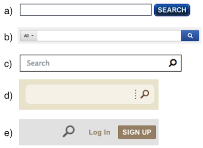
The Magnifying-Glass Icon in Search Design: Pros and Cons

Recommendations on how to best use the magnifying glass icon for search fields. Oddly, there’s no mention of the problem that the icon is ALSO used for zoom controls.

The Magnifying-Glass Icon in Search Design: Pros and Cons


Users recognize a magnifying-glass icon as meaning ‘search’ even without a textual label. The downside is that icon-only search is harder for users to find.

How I Lost My $50,000 Twitter Username

Wow. Some important lessons here on computer account security, for users and more importantly for service providers. The Twitter name isn’t the scary part…it’s that it was way too easy for the attacker to gain control of the domain name, email and web hosting with just a pair of phone calls.

How I Lost My $50,000 Twitter Username

A story of how PayPal and GoDaddy allowed the attack and caused me to lose my $50,000 Twitter username.
Responsive Design Won’t Fix Your Content Problem

More on Responsive Design. It’s a great way (probably the ideal way) to make your site work across devices. But you still need to tailor your content, too. They’re complementary approaches.

Responsive Design Won’t Fix Your Content Problem

For years, we’ve told clients to serve the same content to every platform. We explained that Responsive Web Design allows content to squish itself into any container. Is it any wonder, then, that the…

Responsive Design Won’t Hurt Your SEO

I love how responsive design is seen as this new idea, allowing your website to adjust to different display sizes and types… when it was one of the original design principles of the web.

Google’s Matt Cutts: Responsive Design Won’t Hurt Your SEO

There are fewer SEO drawbacks when using responsive design versus a lightweight mobile version, but a mobile site can work just as well as responsive design, as long as you avoid dividing your PageRank…